Introduction
The graphics are the core of the interface. This window can be split in three parts: the graphics themselves, the associated legend, and the settings.
Graphics and legends
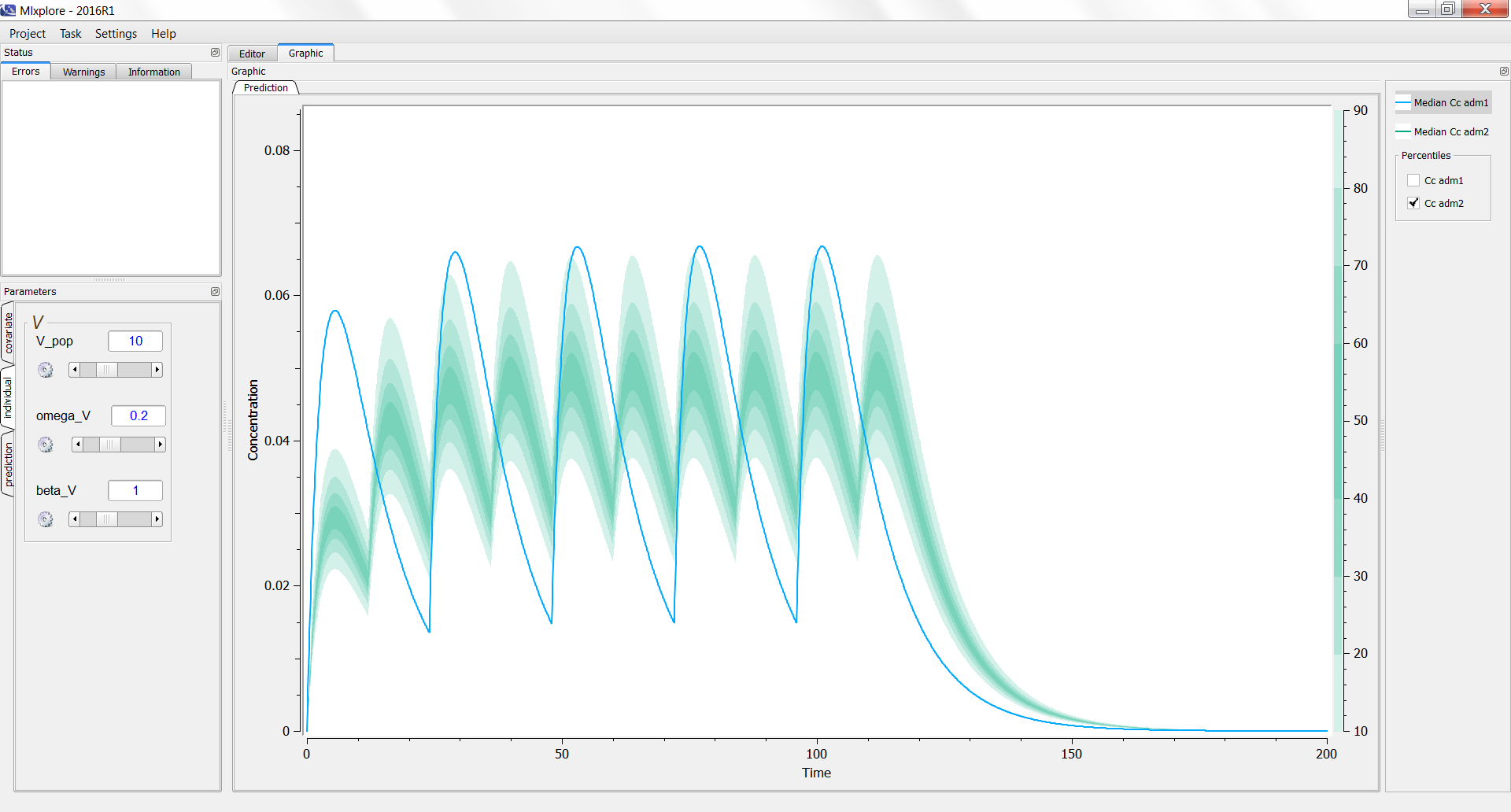
The graphics are displayed in the main window as can be seen in the following figure:
The legend of each prediction for each treatment is displayed on the right of the graphics. The name in the legend corresponds to the prediction name associated with the administration or treatment name. If no administration is done, the name is only the prediction name. All the elements of the graphics can be tuned using the graphics settings as follows.
Graphic settings
IIV
The user can activate and deactivate the display of inter-individual variability due to random effects and/or to covariates.
- If the “random effects” tick box is checked, individual parameters are drawn from the parameters distributions and 200 (by default) simulations are run.
- If the “covariates” tick box is checked, covariates are drawn from their distributions and used together with the population parameters to generate 200 individual parameters and run the corresponding simulations.
- If both boxes are ticked, individual parameters are drawn from the population distribution, taking into account the covariates drawn from their distributions.
Note that the check boxes for random effects and covariates are only available if the subsections [INDIVIDUAL] and [COVARIATE] exist.
Axis
For each plot, the user can choose
- The label of the X-axis, the possibility to display it in a log-scale and the variable for the X-axis. By default, the X-axis corresponds to the time, but one can look at an output w.r.t. another one for instance.
- The label of the Y-axis, the possibility to display it in a log-scale and the variables for the Y-axis. The user can choose the variables to display among all the outputs he has defined in the project. In addition, several outputs can be displayed on the same graphic.
- The limits of the X-axis and Y-axis. To set the limits manually, the user can click on “Manual limits” and choose the minimum and maximum values of the X-axis and the Y-axis. The maximum value must be strictly greater that the minimum value. To set the limits automatically, the user can click on “Auto limits”. By default, each graphic is set independently and automatically to its best values. The user can click on “Same X” and “Same Y” check boxes to share the same X-axis and Y-axis limits respectively.
Notice that when both iiv and log-scale for the Y-axis are activated, the graphic represents the log of the percentile of the variable of interest and not to the percentiles of the log of the variable of interest.
Data
The user can overlay data on the graphics. This is helpful in the pre-analysis to see if the model is representative of the data under consideration. In case of data with several individuals, all individuals are plotted with the same color. To see how to overlay data, click here.
Percentiles
In this tab, the user can define:
- Bands: The number of bands considered for the plot. By default, the value is 8. The value is bounded between 0 and 100.
- Level: The level under consideration. This means that the displayed percentile bands will go from
to
. By default, the value is 90, and it is bounded between 0 and 100.
- Simulations: The number of simulations performed. By default, the value is 200, and it is bounded between 1 and 10000.
 to
to  . By default, the value is 90, and it is bounded between 0 and 100.
Style
The user can define the style of all outputs. In terms of style, the line width and style (solid line, dashed line, etc) are common to all outputs. On the contrary, the color of each treatment for each variable can be defined by the user. By default, Mlxplore keeps the same colors as defined during the previous use.
Buttons
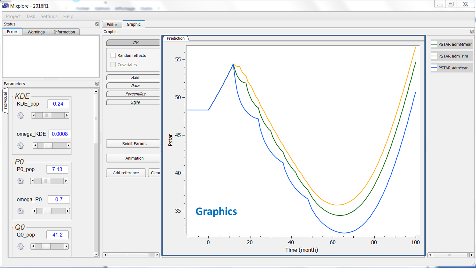
Several buttons are at the disposal of the user:
- “Reinit Param.” allows to reinitialize the parameters to the ones defined in the project file.
- “Animation” allows to make an animation of the predictions w.r.t. time. This is useful when an output is represented w.r.t. another one (rather than w.r.t. time).
- “Add reference” allows to freeze the currently displayed predictions. When moving the sliders, a second curve will appear. This is particularly useful when the user wants to compare predictions with varying parameters. For example, it is possible to add several references (named ref 1, ref 2, …) for several values of a parameter to see the impact of this parameter on the outputs. Notice that it is only possible to make references on the predictions, it is not possible to make references for the iiv simulation distributions.
- “Clean” cleans the references.
Notice that all the buttons are disabled when iiv are activated.
Legend
The legend is clickable to hide/unhide elements:
- clicking/unclicking on the prediction in the legend zone allows to hide/unhide the associated curve
- checking/unchecking the check box in the percentiles box allows to hide/unhide the associated distributions
On the following example, we compare the same model with two different treatments. Using the legend, we can see the prediction of the first treatment (adm1 in blue) and the estimation of the variability of the second one (adm2 in green).